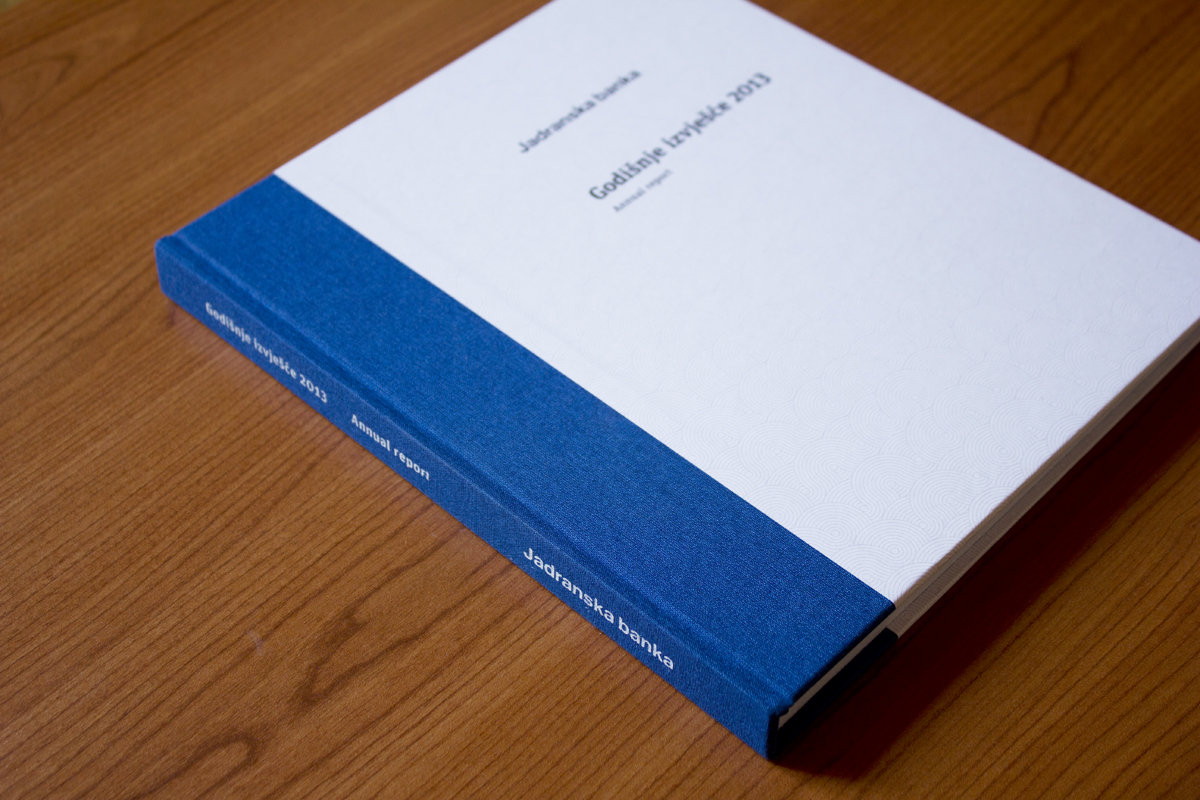


Jadranska Banka | annual report design
We collaborated with Jadranska Banka for several years, developing and refining their annual reports. The 2013 edition represents the most complete and technically resolved version of that work.
Design Framework
The project required strict adherence to the bank’s long‑standing visual identity, shaped by late‑modernist Croatian design. Our approach focused on systematizing and updating the existing elements, introducing consistency, improving readability, and aligning the identity with contemporary production standards.
Materials & Production
- Textile spine, partially extending onto the covers, providing structural durability and a distinctive tactile detail.
- Premium cover stock selected for rigidity and clean surface texture, ensuring stable color reproduction.
- Offset printing with controlled color calibration to maintain the bank’s characteristic blue across all materials.
Layout & Typography
- Bilingual content (Croatian/English) organized through a strict modular grid, ensuring alignment across narrative text, financial tables, and charts.
- Professional typographic setup optimized for financial reporting: clear hierarchy, stable tabular numerals, and consistent spacing across sections.
- Data visualization system built from modular components, allowing charts and tables to remain legible at various scales and across both languages.
Parallel to the annual report, we were developing a broader update of the bank’s visual presence:
- Interior design concepts for branches
- A complete signage and wayfinding system
- Office materials and applications
- Early groundwork for a refreshed visual identity
Although the bank was later sold for reasons unrelated to design, the 2013 annual report stands as the final and most refined iteration of our work for one of Croatia’s historically significant financial institutions.
Related Posts
Spirit of the Sea | logo and visual identity
Spirit of the Sea is a logo and visual identity project developed for a Croatia-based…

Gravinarija | brand and product development
A few years ago, my brother Ivan and I began an unusual experiment on our…