


Sacra Studio Font Gallery
Our fonts are artifacts of heritage, a conveyance of clarity, and a ceremonial act of renewal. Each type family is crafted as a living artwork, balancing strength and grace, tradition and innovation. Together they form a constellation of voices, prepared for enduring texts and contemporary expressions alike.


Symbolum
The heritage awakened.
Symbolum is the first contemporary interpretation of the Glagolitic script, a rediscovered Croatian gem with unique, striking letterforms. Inspired by Glagolitic yet not a revival, it invents new characters to cover the Central European set. This slab serif suits branding, game design, art projects, and even longer, complex texts.

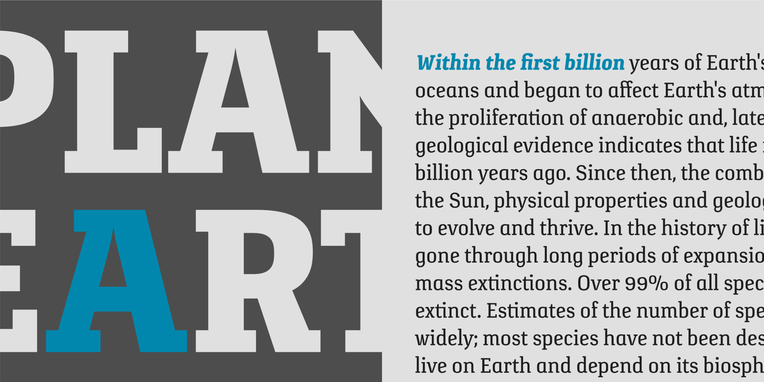
Verge
Exploratory information transmitter.
Verge stands at the meeting point of art and technology, a slab serif shaped with innovative stability. Compact and clear, its forms speak with minimal delay, prepared for any environment. Suitable for branding, long texts, infographics, and signage, it is a typographic constellation of precision and clarity.


Bovid
Ready to clash.
Bovid draws on Adriatic heritage and the natural form of ram horns, uniting sport and tradition with fearless energy. Its bold and legible shapes, low in contrast and strong in numerals, empower jerseys, posters, flags, and tickets with a spirit ready to clash for victory.


Wieldy
Crafted character.
Wieldy is a crafted typeface of prime quality, rooted in the tradition of Central European Arts and Crafts. Full of character and rich in detail, its extended serifs and dotted connections give it artisanal distinction. Suitable for visual identities, packaging, and book headings, Wieldy brings craftsmanship into contemporary design.


Peristyle
Fortiter in re, suaviter in modo.
Peristyle embodies the monumental court of Split’s ancient palace, a threshold where heritage and faith endure. Rooted in Uncial tradition, its wide and rounded letters carry confidence with gentle strength. Suitable for cafes, restaurants, shops, hotels, and cultural projects, Peristyle transforms Roman grandeur into a living script of Dalmatian identity.


Rail
Grandeur precision & leverage.
Rail is a slab serif built to carry large volumes of information with strength and clarity. Its precise construction ensures comfort and legibility, avoiding friction in complex projects. Designed for reading enjoyment, it serves well in magazines, annual reports, and demanding typographic work.


Submariner R24
Diving sans serif experience.
Submariner R24 refines the Submariner family with softened forms and rounded corners. Its humanistic foundation remains, yet openness and elegance broaden its use, from long texts and graphics to headers, signage, and decorative inscriptions. A quiet typographic discovery of enduring grace.


Submariner
Waterproof sans serif technology.
Submariner is a type family forged for endurance and clarity, carrying strength with quiet dignity at every depth. Its humanistic structure withstands the weight of information while remaining open and luminous. With wider endings and balanced forms, it serves as a vessel for long texts, guiding infographics, annual chronicles, and wayfinding inscriptions.


Rusulica Antique
Distinct aroma & flavor.
Rusulica Antique refines the original script with rough edges and antique charm. Ornamental yet playful, it carries high contrast and offers alternates for nearly every capital, opening rich possibilities for expressive and decorative use.


Rusulica
Pure elegance.
Rusulica is a script of fluid elegance, blending modern glamour with ornamental playfulness. Its pure construction and high contrast open many possibilities, with alternates for nearly every capital. A living handwriting, versatile for both decoration and expression.